New to print design or just looking to get some tips on how to make your prints better? Here are some tips to get the most out of your prints, beyond purchasing the best photo printer you can find.
Fonts Set the Mood
Choose your fonts carefully. The type of font on the page is what sets the mood and tone of the print for the reader. Don’t use a causal looking font if you are going formal. Stay away from fonts that are too fancy. Basic fonts go a long way.
Try Color Inversions
Black on white is the standard, so break that standard. Use a lighter color on dark background paper to give some more impact to what you are printing.
Use Grid Layouts
It is very tempting to get crazy with the way a page is laid out. Unfortunately, that can cause confusion, disorientation and even disinterest in your reader. Stick to the grid and keep your boxes proportional. Simplicity and elegance will keep someone reading.
Refine Your Message
Keep down on the text. If people see a page full of writing or images, they are tempted to scan or just move on. If you keep your text compact and to the point, you will be able to get your message across more effectively. This takes practice, so don’t be discouraged.
Use High-Quality Images
Don’t settle for fuzzy, blurry or improperly sized images. You want the image to clearly depict what it is supposed to represent. Anything less will detract from the overall print. Good photography ups the quality of your work. Bad photography drags your work down to its level.
Break the Standard
Yes, your printer may only take 8 ½ x 11 paper, but why should that stop you from experimenting with sizes? If you own a good pair of scissors or a paper cutter, you can fully experiment with size and even shapes.
Check your Bleed Settings
Your printer head needs some room; that’s what bleed is all about. Bleed is that part on the side of the paper that gives your printer breathing room. Don’t forget to leave some room for it.
Break the Margins
It’s amazing what the human mind can do when reading or viewing something. It fills in lots of gaps that you may want to leave intentionally for effect. Don’t be afraid to break your margins and intentionally cut some things off.
Try Overprinting
Don’t be limited by the colors that are given to you by your printer. Try overprinting for cool color combinations, new colors or effects.
Make it Readable
Remember, the point is to make something people can and want to read. If you get too fancy, it may detract from the point of the print: reading. Your end product should always be readable and presentable to get the proper message across.
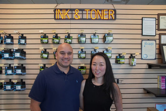
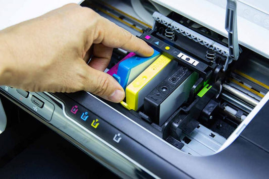
Do You Know Where to Get Photo Ink in Las Vegas?
Looking for ink for your printer? Have you run out and need same day delivery? Check out Las Vegas Ink, the best ink printers in Las Vegas; we have what you need. We can also offer expert printer repair in Las Vegas—call us today to learn more!