Although going to a print shop down the street will provide you with many options for printing flyers, we all know this can come at a hefty price. For many of us, the costs outweigh the benefits, driving us to print our own flyers at home or at the office.
The truth is that while you can’t print a flyer at home quite on the level of professionals, you can get darn close. If you get replacement printer ink, you can even bump up the quality with bold colors that really pop. By following some simple design principles — and more importantly, avoiding common mistakes — you can make a gorgeous, eye-catching flyer without a trip to the print shop.
Don’t Use Comic Sans! (Or Any Generic Font)
The last thing you want your flyer to look like is something a local teenage babysitter would make at home in 20 minutes. So stay away from the word art, clip art and cheesy, recognizable fonts like comic sans. Instead, realize that you can branch out and find some gorgeous, professional-looking fonts for free without resorting to the default ones anyone could recognize in an instant.
Try to save the most bold and stylish fonts for headlines while using highly readable text for important details and the finer print.
Set Your Print Quality Up
You can adjust your print quality in the print request menu from your default settings to high quality. You can also change the resolution to use a higher dpi (dots per inch) than usual.
On inkjet printers, note that this setting will adjust the speed to make the print process slower and use more ink. It may also saturate the paper, so you will want to get a heavier stock than the typical 20 lb white printer paper.
You can even use glossy photo paper and a photo printer to make gorgeous, photo-quality prints if you felt so inclined.
Use All of Your Space
Too many flyers look like this:
HEY YOU!
Come to Our Thing:
Wednesday, April 32
7:00 PM
By centering the text, the flyer has left lots of dead space on the edges. This emptiness draws the eye to the center initially but then leaves the reader painfully bored within seconds.
Instead, try arranging your flyer into an asymmetrical grid, sort of like the layout on the front page of a newspaper. Have an eye-catching, almost-centered banner headline in your prettiest or most noticeable font towards the center or top third of the page, then make all your other elements frame this headline just like lesser story headlines.
Smaller details should be in boxes towards the bottom of the flyer, allowing someone to absorb the most important information first and then filter down once they decide they are interested.
Keep Everything Brief and Organized
You don’t want your flyer to be too wordy or too busy in general, so try to edit your message down as much as possible while still getting the main points across. You should also make sure to use enough white space to keep everything from looking cluttered, so give your headers room to breathe even though they may not be perfectly centered.
Also, try to avoid using too many clashing fonts, colors or design elements. If you want a certain color, shape or wording to stand out, tone down everything else around it.
A great way to see if your flyer is readable at a distance and not too busy is to zoom out to 25% scale and see how it looks there. You can also print a test page out and place it across the room to give it a real-life test run.
Proofread, Proofread Again, and Then Get Someone Else to Proofread
Nothing ruins a stack of beautiful flyers quite like a typo!
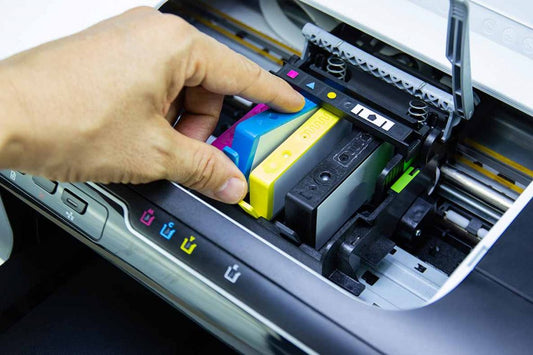
Make Sure You Don’t Need Replacement Printer Ink
If you try to print on clogged printheads or using old, nearly empty ink, you are going to run into quality issues right off the bat. Get the replacement printer ink in Las Vegas you need to create quality flyers by coming to Vegas Ink and Toner today.